Adobe’s FormsCentral
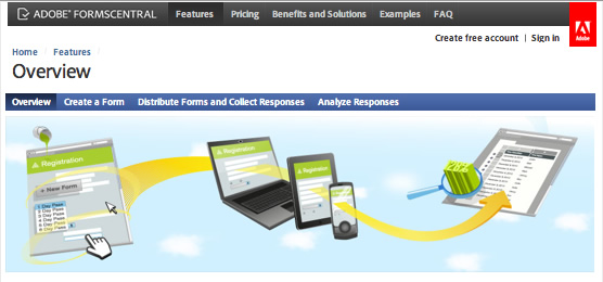
Adobe have launched a new cloud-based service – FormsCentral. Read more »

PDF forms in Apple Preview
René Magritte’s “The treachery of images” is one of my favourite visual statements. It challenges me to think about what I am putting down on paper. I think that it is also relevant to this topic:
“This is not a form (when opened in Preview)“.
If there is a possibility that your forms may be opened by users with a Mac, then this information is for you! Read more »

Any colour, as long as it’s black
In the enterprise world, our forms tend to be dull and grey. The focus may be purely on harvesting the data and less on the visual appearance of the form. However with careful use of colour, our forms can be more approachable. Read more »

Buttons
LiveCycle Designer ES2 has a range of built-in buttons. While each button provides a different function or purpose, the appearance of the buttons is the same – standard grey. You may be perfectly happy with this, but users who have experienced HTML/Flash web based systems may expect more.

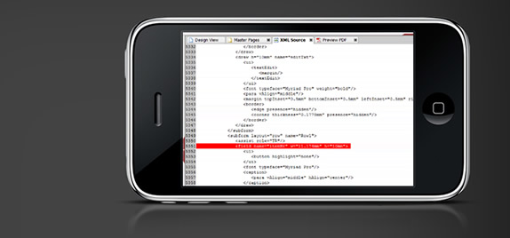
Editing an XFA form on an iPhone
Well sort of anyway! We are using the new Parallels Desktop 6 for Mac, which includes a cool feature where you have full access to your virtual machine via a free iPhone app.
Read more »


 Stefan Cameron on Forms


Recent comments