Buttons
LiveCycle Designer ES2 has a range of built-in buttons. While each button provides a different function or purpose, the appearance of the buttons is the same – standard grey. You may be perfectly happy with this, but users who have experienced HTML/Flash web based systems may expect more.
First off, I have prepared a sample, Assure Dynamics Buttons, which will open in Acrobat/Reader.
A button’s purpose
A button exists to carry out an action, which is initiated by the user.
 The purpose of the button should be clear to the user, so that they know what will happen when they click it. The user should not get a nasty surprise after clicking a button.
A button represents a call to action for the user. The button’s caption should clearly communicate the action to the user.
The caption should include a verb, so that the user knows that by clicking the button a clear action will be executed.
What is affordance?
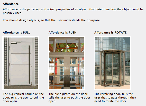
Affordance is the “perceived and actual properties of an object, primarily those fundamental properties that determine just how the object could possibly be used” – Donald Norman.
For example, the affordance of a door with a handle is pull, whereas a door with a push plate the affordance is push.
This principle is important when designing buttons. You want to make it clear to the user which objects can be used and importantly how the objects are to be used. For example the button’s visual appearance must give the user clues that the object can be clicked.
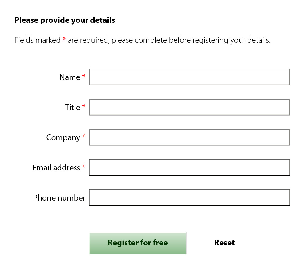
For example, if you take the button on the left, it does not have a distinct border and is flat. The user cannot appreciate from the visual appearance that this object can be clicked. The caption “Register for free” is the only suggestion that the object is interactive, indicating that there may be a pay-off for the user if the object is investigated further.
On the other hand the button on the right has a higher affordance of click. The etched border and linear gradient shading gives a much better visual clue to the user. In addition the direction of the gradient changes, as the user clicks the button, further confirming that the button was successfully clicked.
Standard LC Designer grey button
When you place a standard button onto the form, it will be displayed as a grey fill with a raised 3D border and a black text caption. By default the highlight is set to inverted.
This behaviour is satisfactory as the user is familiar with this appearance and will know that the object is a button. The disadvantage is that it is bland and does not take advantage of the use of colour to communicate its purpose.
Primary and secondary buttons
Caroline Jarrett and Luke Wroblewski both propose that buttons can be distinguished as having a primary action or a secondary action. Where your forms requires a secondary button, it is beneficial to the user to make a visual distinction between the primary action button and the secondary action button.
I would recommend using a positive colour for primary action buttons, whilst maintaining the button’s affordance. Secondary action buttons can then have a muted appearance, to differentiate its lesser role. This is particularly important where the secondary action is negative, for example “reset” or “cancel”.
Extending LiveCycle Designer buttons
The sample shows how to improve the visual appearance of the standard LC Designer button, while still maintaining its affordance. For primary action buttons, I tend to use complementary shades of a colour for the gradient background and for the caption.
For secondary action buttons, I remove the fill and border and use script in the mouseEnter and mouseExit events to provide a link appearance for the button. Talking to our users we find that the purpose of the secondary action button is still clear and the user can find the button if they need it. Another advantage is that the button tends not to be clicked in error.
Your views
I would welcome your views and experiences, in particular in relation to the visual appearance of the secondary action buttons.


 Stefan Cameron on Forms


Beneficial info and excellent design you got here! I want to thank you for sharing your ideas and putting the time into the stuff you publish! Great work!
You’re welcome!
New code solutions are posted regularly, so when you visit make sure you order the solutions by “date” order to see the most recent.
Niall
[...] Buttons [...]