
Any colour, as long as it’s black
In the enterprise world, our forms tend to be dull and grey. The focus may be purely on harvesting the data and less on the visual appearance of the form. However with careful use of colour, our forms can be more approachable.
Colour as a brand touch point
Including the company’s logo on a form is probably going to be mandatory. Rather than just sticking the logo in the top right corner, why not use it’s main colours in other form components.
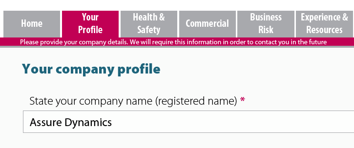
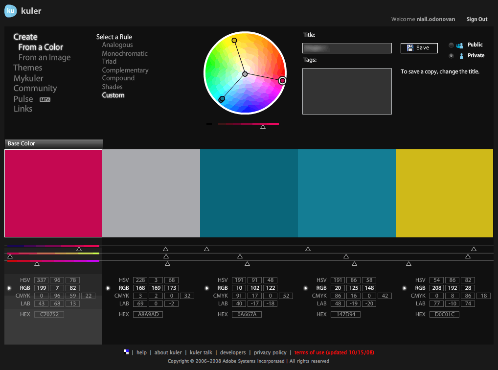
For example, one of our client’s logos has two main colours 199,7,82 and 168,169,173. When developing the navigation tabs along the top of the page, we used these colours to create a stronger association between the form and the brand.
The purple colour is also extended to other elements, such as the required field asterisk.
While the background colour of the header space is white, we have set the background to the form to a light grey (250,250,250). This slightly reduces the contrast between the background and the text, which improves readability. The grey background is formed using a rectangle on the Master Page, set to “visible (screen only)”.
The background colour of the fields is an off-white (253,253,253), which maintains readability of the text.
Overall, this approach generates three subtle zones: (1) the white header with navigation tabs, (2) the light grey form and (3) the off-white fields.
Colour as a call to action
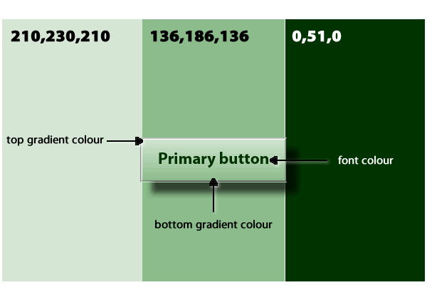
We tend to use colour to extend the standard LiveCycle button. This can help reinforce the purpose of the button. For example, green for primary action buttons.
While the navigation tabs above are flat, borderless buttons, for standalone buttons I tend to use an etched border with a linear gradient from top to bottom. I try to ensure that a variation in shades are used for the button.
 Conversely we want to drop back the visual appearance of secondary action buttons, so that they are less likely to be clicked by accident.For example, here we have used a button with no border or fill. The caption becomes red and underlined on mouseEnter.
Colour as visual feedback
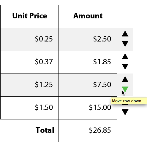
Another good use of colour is to give feedback to the user, either as they input data or if their action is prohibited. For example when setting up arrows to allow a user to move rows up and down a table, it is a much better experience to change the colour of the arrow. A green colour indicates that the user can move the row.
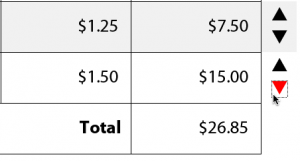 On the other hand if the row is already at the bottom of the table, the row can’t be moved down any further. Changing the arrow to red tells the user they have hit the bottom of the table, rather than popping up a messagebox.
Colour tools
Once you start to introduce colour into your forms, you will want to avoid chucking down just any old RGB that springs to mind. In addition you don’t want the colours to be fighting with each other or dominating the form.
We use Adobe’s Kuler web tool to select complementary colours for each project. Once you have plugged in the base colour (eg the prime colour from the client’s logo), you can generate a range of supporting colours. These can be complementary colours, shades of the base colour or a triad of colours. You can adjust these as necessary.
From this you should end up with a palette of no more than three colours to use in your form.
What do you think?
Would you agree or disagree? What are your experiences in using colour on your forms. Please share your views here.


 Stefan Cameron on Forms


Hi Niall,
the Kuler seems to be a very great tool. I didn’t know it before.
Thanks for this article.
Best
Marcus
Thanks Marcus!
Kuler is great tool and is very easy to use. It integrates very well into Creative Suite applications, like InDesign, where you can import the final swatches.
For LiveCycle projects I tend to take a screenshot of the final colour settings and then save this in the project folder.
My big wish for LC Designer would be to have the custom colour definitions to persist in-between sessions. It’s a bit of a pain having to redefine the project colours each time I go back to work on a form.
Niall